
From Paper to Pixel: Why I Picked Up Procreate Again
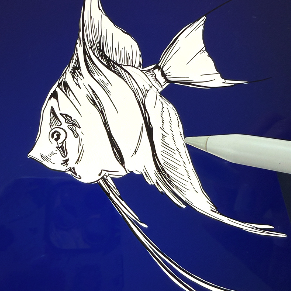
I don’t often pull out Procreate on the iPad. I’m much more of an analog illustration gal! But for this particular project - The Sapphire Project menu artwork (around the text) - the medium felt right.
If you haven’t used it before, Procreate is a powerful digital illustration app designed for artists, designers, and illustrators who want the freedom of drawing by hand, but with all the benefits of digital creation. Think; layers, brushes, colour control, and easy editing. And once you get the hang of it, there’s heaps you can do with it - if you’re anything like me, a few YouTube tutorials will do the trick!
Procreate allows artists to mimic the natural flow of sketching on paper, but with an undo button (PHEW haha). It’s great for experimenting with colour palettes, sketching quick concepts, or anything that needs to be scaled or refined digitally. It’s also perfect for storyboarding or visualising ideas before committing them to paper or canvas!
I’ll always be an analog artist at heart, but tools like Procreate make it easier to adapt to different client needs. Sometimes, digital is the best way to achieve the look, feel, or precision a project calls for. Other times, nothing beats ink on paper.
Remember: it’s all about choosing the medium that helps the story come to life. And for The Sapphire Project, Procreate was the perfect match.

(Haha, you can see the crack on my iPad screen on the third picture.)